

When your users are a kid and their guardian, in the same app



What Drip is
The product exists to grow financial literacy in the next generation. The hypothesis: if you teach someone to invest when they’re twelve, they’re a different kind of adult investor at thirty.
Drip is an Australian micro-investing app for kids under 17, supervised by a parent or guardian. Kids learn to invest with small amounts of real money. Parents stay in control — approving the account, setting limits, and overseeing what their kid does inside the app.
Drip launched in Australia in 2022 and was covered by Savings.com.au as “educational micro-investing designed for kids and adults.” In July 2025, Drip joined ASX-listed Raiz Invest. This case study covers the version I designed at launch.




The design problem - two users, one app
Drip wasn’t built to be another investment app. It was built as a mission: increase financial literacy in the next generation of Australians. If the mission worked, the business worked.
Two users. Two mental models. One product that had to serve both without compromising either.
The kid
The kid needed the app to feel like something they’d actually open. If the kid flow felt like a bank app, no one would use it — and the mission would quietly fail.
The parent
The parent needed the opposite. For a parent to hand a financial app to their child, it had to feel serious, trustworthy, auditable. They’re the ones taking the risk.

Who I talked to
Before design started, I ran user interview sessions with Australian parents. The group wasn’t homogeneous.
Some had investment backgrounds and wanted their kids introduced to the space early — guided, with guardrails. Others saw their kids drawn to technology and wanted to channel that interest into something with long-term value.
Different starting points. Same instinct — a safe way to let their kid participate in something they considered important.
Mapping the finding
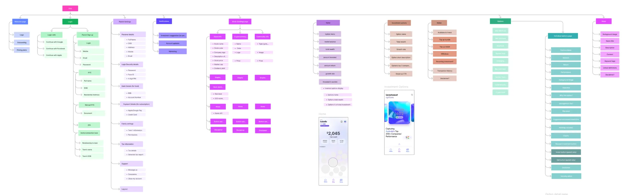
Both users share one app, but they don’t share a view. The architecture had to encode that distinction structurally — from the first screen to the last permission check.
One app. Two user models. One structure that keeps them separate without keeping them apart.
Each user has their own entry point
The kid lands in a home organized around participation — their investment state, a browse surface for investment options, and a chat surface for guided learning.
The parent lands in a home organized around oversight — account health, financial infrastructure, and the state of their teen’s activity.
Designing the kid flow
The thesis for the kid flow was simple: every screen the kid sees should be a teaching moment, disguised as a product moment. If a twelve-year-old is going to open a financial app, the app has to earn its place in their day. If it also teaches them how markets work along the way, the mission is working.












The kid can start first and invite parents
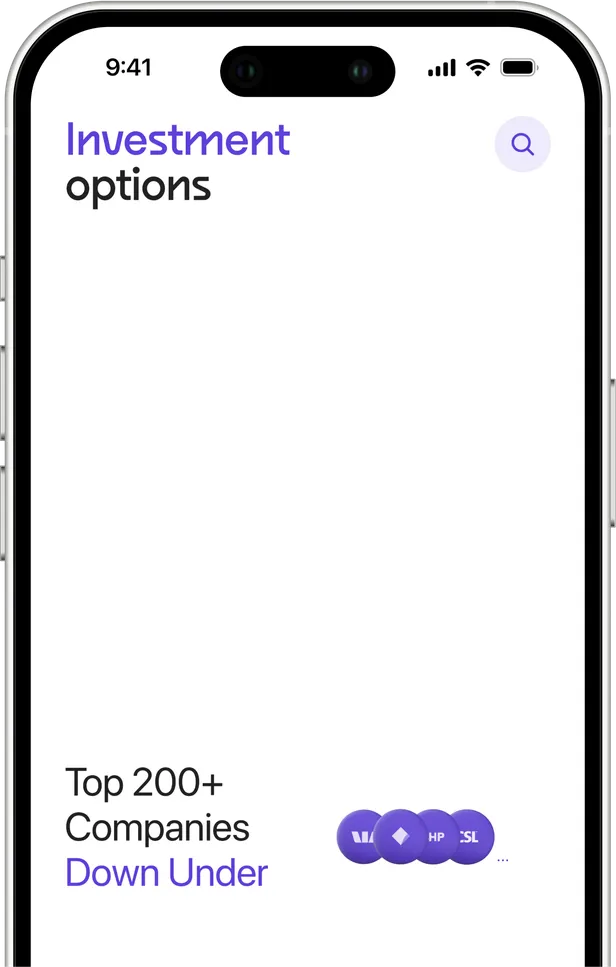
A teen can download the app and begin before their parent has an account. If the parent hasn’t set one up yet, the teen enters the parent’s mobile number and the app sends them an invite. The kid is often the one drawn to the idea. The parent is the gatekeeper, not necessarily the originator.
Investment options as themes, not SKUs.
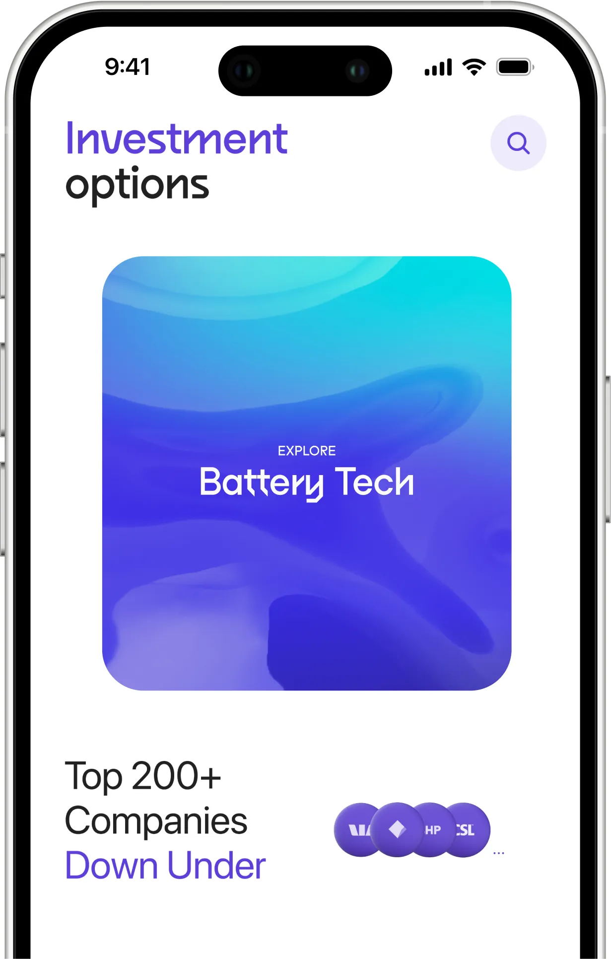
The browse experience shows cards like “Australia 200,” “USA 500,” “Big Tech,” “Battery Tech,” “Cyber Security,” “Emerging Markets” — each with a one-line thesis. A twelve-year-old can hold “Big Tech” in their head. They can’t hold “VOO.”
Each option teaches how to evaluate it
Drilling into an option opens the same set of sections every time — About, Risk, Why drip it?, Holdings, Low management fees, To have in mind. The structure is the lesson. Every time the kid explores an option, they encounter the same evaluation framework, until it becomes how they think about any investment. The structure is the lesson. The framework becomes muscle memory.
Investing requires articulation
Before the kid can invest, they fill in a short “Why Aussie?” note — explaining why they’re making this choice. The parent-set Max Limit is visible above the amount, so the kid feels the guardrail without being blocked. The “Why” field forces the kid to think through their reasoning. The parent can read it later. A guardrail from the parent. A reason from the kid.
Celebration, not anxiety
The post-trade screen says “What a Splash!” with a burst of bubbles. Investing is framed as a thing to feel good about, not nervous about. For a first-time investor at any age that affective framing matters — but for a twelve-year-old making their first trade, it matters more. The confirmation isn’t a receipt. It’s a small moment of pride.
Designing the guardian flow
The guardian flow is long. Roughly 35 screens from “I am an adult” to “Welcome to drip.” The length wasn’t a design choice — it was the honest cost of opening a real investment account for a minor in Australia.

What the law required for onboarding
KYC identity verification against the Australian Government Document Verification Service (DVS)
AFSL compliance Target Market Determination, Financial Services, Product Disclosure Statement
Tax residency declarations (Anti-Money Laundering and Counter-Terrorism Act 2006)
Investor eligibility self-assessment (ASIC)
Guardian–minor relationship verification (Medicare card or birth certificate) Funding account setup via Direct Debit Request
None of these were negotiable. The design response wasn’t to compress the flow it was to make a long compliance flow feel like a conversation.
How we made it bearable
One question per screen. Name, mobile, DOB, address, email — each isolated so the parent is answering a conversation, not filling a form.
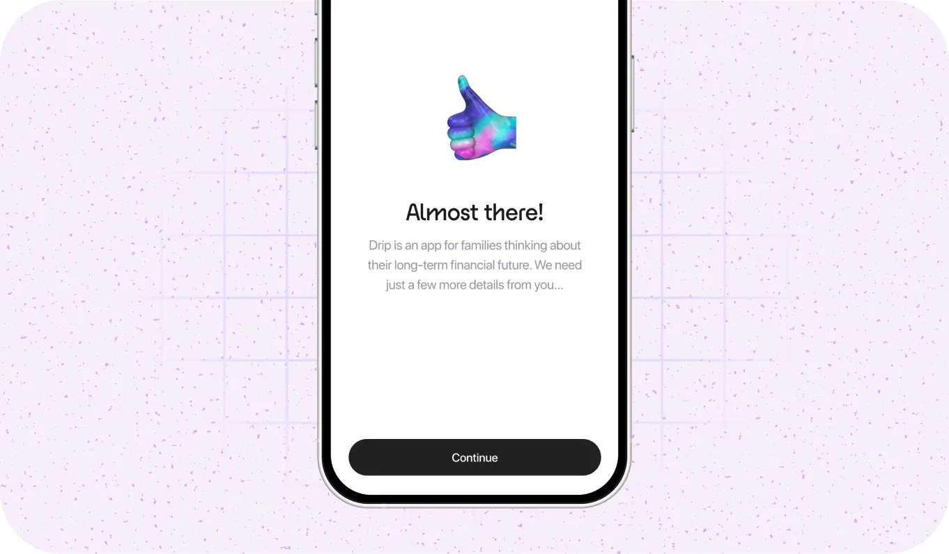
Named checkpoints with warmth. “Almost there!”, “You are ready to be an investor!”, “Now, let’s set Maria up!” — screens that do emotional work, telling the parent they’re almost through.
Progressive trust-building. The regulatory documents appear after the parent has invested enough in the flow that reading them feels earned, not like a wall.
Eligibility as self-reflection. “Are you willing to risk capital loss?” is framed as judgment, not qualification. Answering No routes to a graceful off-ramp.
“I’ll do it later” as design, not failure. Funding account setup and document uploads both have skip paths — the parent completes onboarding and finishes these from the right physical location.
The flow can’t be short. What it can be is warm, honest, and designed so a parent who makes it through feels respected.

The product respects where the interest comes from.
Where the two flows meet
The parent and the kid aren’t using the app in parallel. They’re using it in relationship. Every meaningful design moment in Drip lives at one of these handoff points.
The invite — either direction works, but the design respects the kid-initiated path
The teen can download the app first and invite the parent, or the parent can start first and invite the teen. Both work. But the design deliberately allows the kid-to-parent path, because the kid is often the pull.
Parental controls — the quiet heart of the product
After KYC, during teen setup, the parent configures what investment options the kid can see. ASX200. S&P500. Big Tech. Emerging Markets. Ethical/ESG. Battery Tech. Commodity. The parent decides, with toggles, which categories appear in the kid’s browse experience. The kid then explores and chooses within that bounded set. The parent shapes the possibility space. The kid plays inside it.
The spend limit — a felt guardrail, not a blocked trade
The parent sets a maximum per-trade amount. The kid sees it as “Max Limit” above the amount field on the investing screen. They feel the guardrail without being blocked by it. If the kid wants to invest more, that’s a conversation to have at the dinner table — the product stays out of it.
The "Why" field — asynchronous accountability
Before the kid confirms a trade, they write a short note explaining their choice. The parent reads it later. A lightweight accountability loop — pedagogical for the kid, reassuring for the parent. The kid articulates. The parent reviews. The interface stays out of the way.
What shipped and what came next
Drip launched in Australia in 2022 through BetterLabs, a Perth-based corporate venture fund. The product shipped end-to-end — guardian onboarding, kid onboarding, investment options, trading, settings, parental controls — as a complete, compliant, live investment platform for families.

For a product designed as a mission to change how families talk about money, joining a larger, publicly listed platform with national reach was the mission scaling, not ending. The design work I did lives on in the audience that was handed over — thousands of Australian families who had their first conversation about investing through Drip’s interface before being migrated to Raiz Kids.